Overview and history
Price overview
Explanation of functionality:
-
We display electricity prices in a simple table view, divided into hours, showing how prices vary throughout the day, with the current hour highlighted.
-
Today's electricity prices per hour are determined by the power exchange the previous day, typically around 12:42. At that time, the so-called "day-ahead" prices are released, which we also show in the app when available, under a separate tab.
-
The electricity prices shown include VAT (except for Nord (NO4), which is exempt), but no other fees or estimates of delivery charge. They are subject to minor currency changes from one day to the next, but usually amount to negligible decimals, rarely more than a few cents in total.
-
The power exchange operates with five Norwegian price zones, with different prices (sometimes certain zones have identical prices). In our price overview, we allow the user to choose between these zones in a separate drop-down menu under the tabs for the day.
-
In addition to the numerical value for each hourly price, we indicate the relative difference in size with a set of bars, where the length corresponds to the ratio to the highest price hour. The bars are also color-coded, with the 12 highest-priced hours marked in red and the 12 cheapest hours marked in green.
Examples of screenshots:
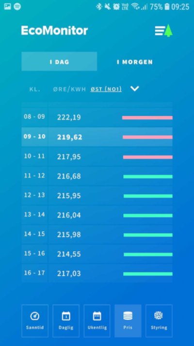
Simple table view with time per hour and corresponding spot price (both numeric and visual bars). The current hour is marked with bold text and a lighter background.
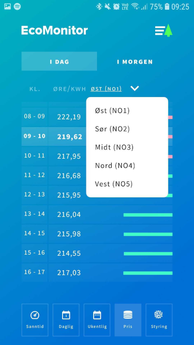
Drop-down menu to switch between the different zones in Norway.
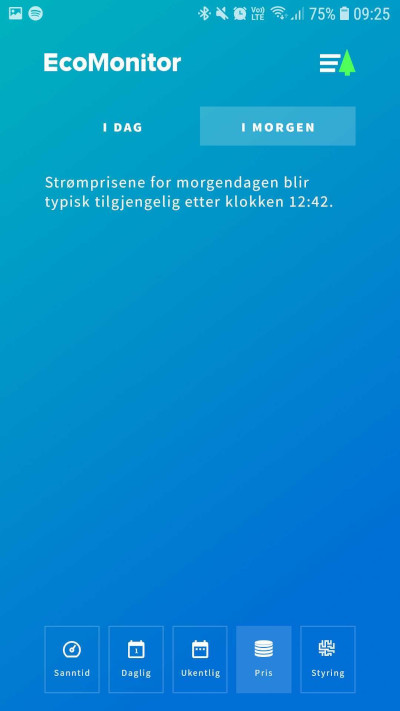
Until (approximately) 12:42 on the current day, data for tomorrow's prices will not be available from the power exchange.
Real-time graph
-
With real-time data resolution down to every 2 seconds, there is a lot of information that can be extracted from a simple visualization of the consumption development. We show a graph for the last 5 minutes, as well as an instantaneous value for the current consumption.
-
Some appliances, events, and patterns can be identified with such resolution and historical development. For example, one can find so-called "power thieves" just by observing abnormal peaks and how long these peaks persist. Users can also turn on or off different equipment or fuses, and by the subsequent impact on the graph, see what consumes the most power and check if the appliance/equipment is drawing power in accordance with the product description.
-
Examples of screenshots:
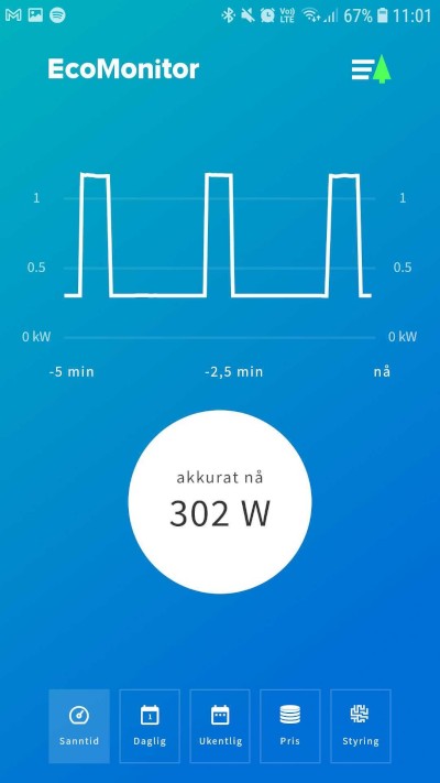
Real-time graph - typical pattern of a single thermostat-controlled panel heater after a period of stable temperature.
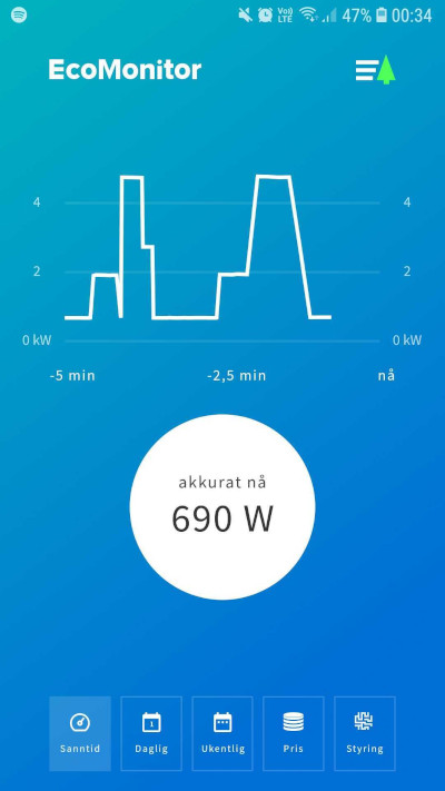
Real-time graph - pattern of several different thermostat-controlled heating elements that turn on in near synchronization after a period of being off.
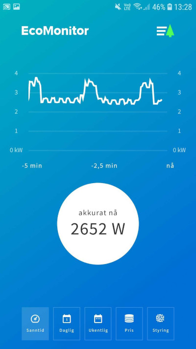
Real-time graph - typical pattern of a washing machine in the middle of its cycle + thermostat-controlled panel heater.
History
We show historical consumption data from the time of installation of the monitoring unit.
- Overview of all days in the form of a bar chart, with distribution of consumption per hour
- Overview of all weeks in the form of a bar chart, with distribution of consumption each day
- We also estimate the accumulated consumption for the current hour/day and show it in the charts, with a cross-check against the meter reading after the period ends.
Eksempler på historikkvisninger:
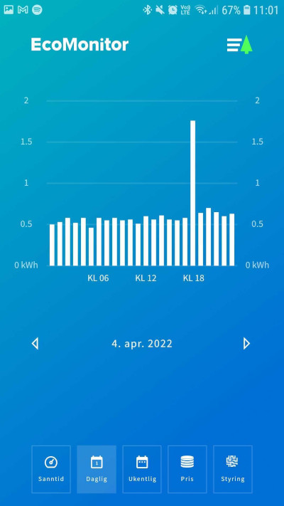
Daily view, with consumption distributed in bars for each hour. A clear peak around noon is not uncommon.
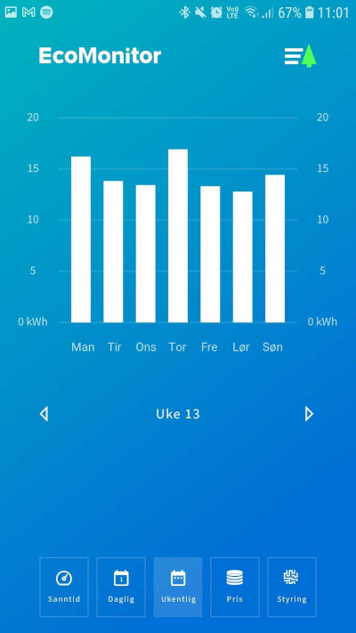
Weekly view, with consumption distributed in bars for each day.